Hi,
I'd just like to say thank you for looking over my blog and examining my coursework. I have really enjoyed creating my piece and the progression from idea to final piece has been a lot of fun. I hope you like and enjoy looking at my work.
Thanks,
Alex Sheldon
Friday, 30 March 2012
Thursday, 29 March 2012
Evaluation Question 1: In what ways does your media product use, develop or challenge forms and conventions of real media products?
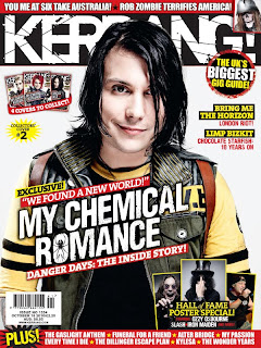
My piece follows several rock genre magazine conventions. This can be seen when compared with Kerrang! magazine.
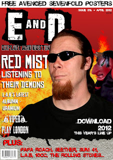
Masthead: My magazine's masthead resembles Kerrangs! greatly. They both use the same white text on black background typography and both use a worn-out looking font to fit with their dirtier genre. Also, both magazine names have no real meaning, mine being two, almost random, destructive words put together, and theirs trying to emulate the sound an electric guitar makes when strummed.
Page Layout: Both magazines also have similar layouts, with a small top banner, the masthead running under it, the main image in the centre and then a banner running along the bottom. There are several differences however, such as how my magazine's cover lines all run down the left hand side, whereas Kerrang! places its main cover line pretty much centre and then has a few other lines down the right hand side of the page. Kerrang also uses a very packed layout, compared to my simpler one.
Costumes, Props, Iconography: The models on both covers have similar styles of clothing, although as my cover model is more heavy metal orientated and the Kerrang! artist is part of an Emo/Rock band, there are several differences. They both have the darker hair which is linked with the genre and darker clothes for the most part, although the Kerrang! artist has some lighter clothing to break it up.
Images: Both images have little effects added to them beyond changing the contrast and brightness and are mid-shots to show the artist without being overly zoomed in or zoomed out. Kerrang! uses several smaller images on their cover as well, to go with their packed layout, whereas mine relies on only one photo on it.
Fonts and Style: The fonts used on both covers are very similar, favouring bolder fonts and for the masthead of both, more worn fonts. All of the fonts on both magazines are also in all capitals, making them stand out and easy to read. The genre is also quite bold and loud, which these fonts play along with.
Colour Scheme: The two magazines have a very similar colour scheme, favouring red, white, black and yellow above other colours. This use of black, white and red goes along with the rock genre conventions as they prefer darker colours. The red and yellow together as shown on my cover adds the fire imagery to it which is seen in the genre reguarly.
Article and Double Page Spread: My double page spread doesn't really follow the conventions of Kerrang! as the usually use one main image that goes across the two pages, whereas I have chosen to use two images, one on each page as I feel it has a good effect and works well with the text. One downside of this however, is that neither image stands out above the other and grabs the attention of the reader.
Evaluation Question 6: What have you learnt about technologies from the process of constructing this product?


From constructing my media product, I have learnt several things about the technology needed to create a magazine.
Firstly, the main program that I used for computer work was Adobe Photoshop Elements 5.0 and Adobe Photoshop CS2. Whilst working on this piece I learnt how to leave a certain object in animage in colour whilst the rest of the image is black and white, using the desaturation tool. I did not however, end up using this in my final piece, as the effect looked quite indie which was nothing like the genre of my rock and metal magazine.
I also learnt a lot about how to cut out images cleanly and to make sure the edges were smooth and faded into the new background enough. To do this I used a lot of the blur tool around the edges of cut out images. This helps to smooth any sharp lines and to make it less obvious that the image had an original background.
I also learnt about the importance of using a good camera for my work. For my testshots I used the camera on my phone which had alright quality, but required all of the images taken from it to be sharpened to make them look less blurry. For my final piece however, I took the majority of my photos using a professional camera. This helped to make the pictures appear sharper and less flat when I came to edit them.
On Photoshop, I have learnt the importance of how images and text fit together. Before, I would have primarily set the text out on top of the image, but having learnt more about layering and magazine layout, I can now tell when it would be better for the text to actually be covered by the image instead.
Also on Photoshop, I used the filter gallery to quickly and effectively add effects to my images. When combined with contrast and brightness effects as well, these filters can make a relatively plain image stand out and fit my rock genre a lot better.
Friday, 9 March 2012
Work Log 9/3/2012
This was the final lesson working on my pieces before I submitted them. I simply finished off my double page spread by placing a quote line over one of the pictures and then printed the three pieces off on photographic paper.
Work Log 8/3/2012
In today's lesson I added the last touches to my pieces. I had shown my work to my teachers and had recieved feedback on it, so I changed some of my pieces to reflect this. I worked mostly on my double page spread, formating how the text would fit in with the pictures and working on the background again to make it the right brightness and contrast.
Thursday, 8 March 2012


Monday, 5 March 2012
Work Log 5/3/2012
For the remaining lessons on my coursework, I will be keeping a log of the work I have done in the lesson on my final magazine piece. In today's lesson I worked on the double page spread, mostly on the background and pictures that will be used on it. I created the splatter type background using a brush which creates this kind of messy look. I then used a watercolour filter to give it a unique look and make it brighter. I also worked on the two main photos that will be on the spread, cutting them out and applying a few filter effects to make them sharper.
Tuesday, 28 February 2012
Improvement Based on Feedback Sheet
After reading the teacher feedback on the final draft of my magazine, I have come up with a few changes and additions I will make to my final version. Firstly, on my cover I need to use one consistent font for the white cover lines down the left side. This will hopefully make it look less busy. I also need to work on the size of my title/logo, E&D, as it seems quite small compared to the main cover line, and is almost dwarfed by it. I should put the date, issue number and price on the front cover as well, as I forgot to do this on the draft. I will make the banner at the bottom smaller as well, as it takes up too much space in comparison to the rest of the cover.
My contents page also needs some changes. I need to work on the sizes and dimensions of the boxes in on the page as they are still a bit off, and it looks quite busy compared to the cover page. The photos I have used (which I did take, but they are only the test shots I had to work with at the time) are over manipulated and I should leave them simpler in the final piece.
With my double page spread, I have still over manipulated the images (which once again, I did take myself and are not copyright as my feedback sheet says) I also have to work on my columns a lot as I don't like the look of them and they definitely need work. I may make them slightly transparent also, but I'll see how that looks first. My lead photo needs to be larger as it doesn't grab your attention enough as a lead photo should. My introductory text needs to be bolder and stand out more as well, as it kind of fades in with the rest of the text as it is. I will also place a quote line somewhere over one of the images as I feel it will make the pages less simplistic.
Sunday, 26 February 2012
Thursday, 9 February 2012
Draft Double Page Spread


Draft Contents Page

The picture used in the Red Mist section is once again just a test shot used until I have taken the actual shots. I like the effect used on the photos for Viper and L.A.B though and will probably keep them similar to this draft. I may also put a picture of the "editor" in that section on the final design. Apart from that, I am happy with the layout of this page and will keep it the same.
Draft Front Cover

The main picture on the cover is currently just a test shot of my model I had to use as I haven't taken the real pictures yet. The actual photo will have him holding the devil puppet up to his ear with a insane look in his eye. I will also probably use another smaller picture of a different artist on my cover next to the "Viper play London" section to add more to it. Finally, the banner at the bottom looks strange and I will probably simplify that in the final design.
Friday, 3 February 2012
Magazine Name - Exploit & Destroy
I have decided to call my magazine E&D, which stands for Exploit and Destroy. I chose this name as I was looking through font styles. I saw one font out of the corner of my eye and thought it said Exploit and Destroy, but it didn't. These two words stuck in my head and I think they suit my magazine well as they sound violent and brutal which fits in with the rock and metal theme. It also reminds me of the tactic used by America when they first entered the Iraq War, Shock and Awe. Its based around a strong and fast attack straight away to completely obliterate the enemies will to fight and their key features. This lends to my magazine which will be like that sudden burst of extreme activity and destruction. Hit them straight from the beginning, quickly and strongly. Also, I have decided that it will primarily be used as its abbreviation, E&D. This rolls off of the tongue easily and will fit easily as a logo for the magazine.
Thursday, 2 February 2012
Final Paper Designs


Firstly, my front cover design shows how my magazine name, E&D will take up a large area on the front cover, making it bold and in your face. I will have a banner that runs along the bottom of the page showing other bands that appear in that edition of the magazine. My picture will be a studio shot, enabling me to take the background out and making it this red theme. The red slowly fades as it goes down the page, making it less flat and boring. My cover line, stating what the main article is about will be on the left hand side of the page, but will go across some of the picture. My contents page will follow the layout shown above, a main picture on the left hand side with the actual contents text running down the right. My logo will appear at the top again, but smaller this time. The editor's message will be in the bottom right hand corner and next to it taking up most of the space at the bottom, next to it, will be the second major article in that issue. My double page spread will follow a reasonably simple design, with the title at the top, several pictures across the two pages to break up the text with a main one on the first page, and the text in between on a white background to make it easy to read.
Test Shots 4


These shots are all almost the same, but a group of people started to walk past as I was taking them and I wanted to see what they would look like if they were slightly in the shot. My favourite of these shots is the very last one. I think the blurred people walking past on the edges of the photo work well in contrast to the crisp focus on the main model.
Test Shots 3


These pictures were mostly taken to try out different colour settings. I think the greyscale in particular, works well and I think the group shots in greyscale are quite effective. I think they may appear rather pop/indie like though if I do use this type of shot.
Test Shots 2


These shots are just generic ones showing different angles, model emotions, zoom and backgrounds. I especially like the ones that were taken on an outside wall background. They add to the gritty style of my magazine. Of these shots, I like the bottom left one as he isn't looking directly at the camera, giving it a more natural look, rather than as if he's posing for the camera. The urban, bricky, on-location background adds to this natural look. For the same reasons, I also like the bottom left one, as even though he is making eye contact with the camera, it still has an urban and gritty look to it. I feel that with a bit of contrast changing and possibly black and white, I could use this photo on my contents page quite easily.
Test Shots 1


These photos are of my main model, Darren. He will appear on my front cover and double page spread as the main artist in my magazine. Darren plays on my hockey team and I felt he would be good for my magazine as he enjoys the genre of music my magazine is aimed at and therefore, looks the part.
Monday, 30 January 2012
Thursday, 26 January 2012
Cover Band Profile
Red Mist is an up-and-coming heavy metal band from Leicester, England. They are known among metal fans for their angrier songs that always seem to have some meaning, occasionally political. For example, their first album, Casual War had very anti-war songs on it such as, 'Dying Like a Dog' and 'Killing to the Sound of Trumpets'. Because of this, they are seen as quite controversial and seem to mix the heavy metal sound with the punk ideology. Their music is particually violent and loud, yet they still retain a good drum beat and incorporate original base and guitar rifts. One of their recent albums, Alone Again focused more on the darker side of human emotions, such as depression, loneliness and anger. This created quite a slowerd and sadder atmosphere around the album, but fans were pleased that they still managed to keep their usual hard-hitting style within it. The band consists of lead vocalist and guitarist, Darren Hicks, drummer Jason McNeil, bass player Chris Tonne, and female lead guitarist Alix. They take most of their inspiration from classic metal and rock bands such as, Metallica, Iron Maiden, Black Sabbath and The Rolling Stones. Recently they have found a lot of success in a tour of Europe called, March To Hell. A lot of their fanbase comes from England for obvious reasons, and Germany, where there is a strong metal following. When March To Hell reached Berlin, tickets sold out within three days.
Pitch Summary
Overall, my magazine pitch went quite well. I managed to cover the majority of my main points, including my name idea, colour palettes, double page spread article ideas, target market, layout and model/photography ideas. Because of this, I ended up gettting limited queries and feedback. One thing that did come up during my pitch, was the idea that I could focus my magazine on 50% classic rock/metal and 50% modern rock/metal. This came up, because I had a lot of classic rock bands in my pitch video. I like this idea as it will make my magazine appeal to all rock and metal fans, young or old. Another thing I found from my pitch, was that my colour palette of having black as the main colour was quite predictable and boring, so I will probably use red as the main background colour, rather than just as a highlight colour. I didn't speak about several things during my pitch, and will answer them now. Firstly, the shots that will feature in my magazine, include a main shot for my front cover which will be a midshot of my main model Darren, with a slightly insane look on his face, holding a puppet of the devil (which I have at home from a children's puppet set) up to his ear as if it is speaking to him. It will be a studio shot, enabling me to remove the background and replace it with a red one that gradually gets lighter the further down the page it goes. I will use three other shots of Darren in my magazine, one for the contents page and two for my double page spread. In all of these shots, he will be wearing a dark t-shirt, possibly black, with black jeans. He will also probably be wearing some form of jewellery such as chains and a necklace type thing. I will use two other photos for the cover page which will be of two other models, one male and one female. This will show that my magazine isn't just aimed at a male audience. I will also use a photograph of an album by a classic rock band to place in my contents near the review section. I have also decided that my magazine will retail at £3.99 as the majority of magazines in shops are around £4-£5, making mine more economical for buyers than say Kerrang or NME.
Wednesday, 25 January 2012
Magazine Publisher
Bauer Media Group are the publishers of Kerrang!, another hard rock/heavy metal magazine. Because of this they would suit my magazine well, as they already have experience in this heavy and dark genre of music. They two other music magazines under them, Q and Mojo, however these two focus on more mainstream music rather than rock. This does however show that they do know what they're doing when it comes to publishing music magazines and getting them out there.
Typical Reader Profile
Jack is a 18 year old student from Leicester. He is currently at University and is studying English Language and Media Studies. He also works part-time at a local newsagents and likes to buy certain magazines to read when the number of customers starts to slow down at the end of the day. He enjoys reading music and gaming magazines during these periods. He specifically enjoys rock and metal music magazines, as these are his favourite genres of music. His favourite bands include Fozzy, Metallica and Papa Roach. He listens to music mostly during his studying, though, he keeps his iPod on him most of the time, incase he wishes to listen to some. He also likes some classic rock bands such as The Rolling Stones, The Who and Black Sabbath. He enjoys his favourite bands to be quite controversial and loud, and has taken on some of their styles in his look, such as dark sleeveless hoodies and several tattoos along his arms.
Tuesday, 24 January 2012
Pitch
The 60s, 70s and 80s are over...the era of classical rock has come to an end. We can still look back and worship them, but it is time for a new age, the age of Exploit & Destroy.
Monday, 23 January 2012
Who Will Appear In My Magazine?
The image on the front cover of my magazine should reflect genre conventions of the magazine's identity. This includes their clothes, make-up, pose and props if any are used. My genre, Rock & Metal, uses darker colours for clothing and make-up, usually based around strong contrasting colours such as black and white. Rock symbolism also revolves around the darker side of life. For example, a lot of it is to do with death, satanic symbols and implied violent imagery. This can be reflected in my main image hrough the use of designs on clothing, possible make-up and facepaint or just general imagery. My genre is still quite wide however, as you have some rock bands such as Papa Roach and Avenged Sevenfold that base their style around black clothing and tattoos, bands such as Metallica that favour more casual clothing such as plain t-shirts and jeans, and bands like Kiss that were platform shoes, leather and facepaint.
Genre of My Magazine
I have decided that my magazine's music genre will consist of the heavier types of music specifically, Rock, Metal, Punk and Grunge. I would like it to be hard hitting to live up to its genre and therefore will use a lot of rock iconography such as fire, skulls, demons, etc. I have choosen these genres of music, as I personally prefer them and also think that they are not as mainstream as they used to be in the 60s, 70s & 80s and therefore will be more interesting than say Hip Hop or Pop. It also allows me to feature some older bands as well as modern ones if I look to the classic rock or metal such as Bon Jovi or Metallica. Because of this choice of genre, I think my colour palette will maily be made up of black, white, red and grey/silver. This fits the genre well as it is usually quite dark and horrorific in its style.
Friday, 20 January 2012
E&D Quick Mock-Up 2

A second quick mock-up, once again just to see how the logo would work and to try a greyscale colour scheme this time.
E&D Quick Mock-Up

Just a quick mock-up I made to see what the logo would look like in a magazine format.
Thursday, 19 January 2012


Magazine Name Ideas

Several magazine name ideas in the possible styles I would use them in. Its as large as I can get it, so I apologise for the small size. Click on picture to zoom in.
Tuesday, 17 January 2012
Monday, 16 January 2012

Wednesday, 11 January 2012
Subscribe to:
Posts (Atom)