Hi,
I'd just like to say thank you for looking over my blog and examining my coursework. I have really enjoyed creating my piece and the progression from idea to final piece has been a lot of fun. I hope you like and enjoy looking at my work.
Thanks,
Alex Sheldon
Friday 30 March 2012
Thursday 29 March 2012
Evaluation Question 1: In what ways does your media product use, develop or challenge forms and conventions of real media products?
My piece follows several rock genre magazine conventions. This can be seen when compared with Kerrang! magazine.
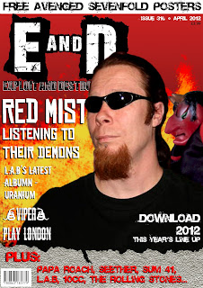
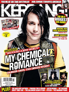
Masthead: My magazine's masthead resembles Kerrangs! greatly. They both use the same white text on black background typography and both use a worn-out looking font to fit with their dirtier genre. Also, both magazine names have no real meaning, mine being two, almost random, destructive words put together, and theirs trying to emulate the sound an electric guitar makes when strummed.
Page Layout: Both magazines also have similar layouts, with a small top banner, the masthead running under it, the main image in the centre and then a banner running along the bottom. There are several differences however, such as how my magazine's cover lines all run down the left hand side, whereas Kerrang! places its main cover line pretty much centre and then has a few other lines down the right hand side of the page. Kerrang also uses a very packed layout, compared to my simpler one.
Costumes, Props, Iconography: The models on both covers have similar styles of clothing, although as my cover model is more heavy metal orientated and the Kerrang! artist is part of an Emo/Rock band, there are several differences. They both have the darker hair which is linked with the genre and darker clothes for the most part, although the Kerrang! artist has some lighter clothing to break it up.
Images: Both images have little effects added to them beyond changing the contrast and brightness and are mid-shots to show the artist without being overly zoomed in or zoomed out. Kerrang! uses several smaller images on their cover as well, to go with their packed layout, whereas mine relies on only one photo on it.
Fonts and Style: The fonts used on both covers are very similar, favouring bolder fonts and for the masthead of both, more worn fonts. All of the fonts on both magazines are also in all capitals, making them stand out and easy to read. The genre is also quite bold and loud, which these fonts play along with.
Colour Scheme: The two magazines have a very similar colour scheme, favouring red, white, black and yellow above other colours. This use of black, white and red goes along with the rock genre conventions as they prefer darker colours. The red and yellow together as shown on my cover adds the fire imagery to it which is seen in the genre reguarly.
Article and Double Page Spread: My double page spread doesn't really follow the conventions of Kerrang! as the usually use one main image that goes across the two pages, whereas I have chosen to use two images, one on each page as I feel it has a good effect and works well with the text. One downside of this however, is that neither image stands out above the other and grabs the attention of the reader.
Evaluation Question 6: What have you learnt about technologies from the process of constructing this product?


From constructing my media product, I have learnt several things about the technology needed to create a magazine.
Firstly, the main program that I used for computer work was Adobe Photoshop Elements 5.0 and Adobe Photoshop CS2. Whilst working on this piece I learnt how to leave a certain object in animage in colour whilst the rest of the image is black and white, using the desaturation tool. I did not however, end up using this in my final piece, as the effect looked quite indie which was nothing like the genre of my rock and metal magazine.
I also learnt a lot about how to cut out images cleanly and to make sure the edges were smooth and faded into the new background enough. To do this I used a lot of the blur tool around the edges of cut out images. This helps to smooth any sharp lines and to make it less obvious that the image had an original background.
I also learnt about the importance of using a good camera for my work. For my testshots I used the camera on my phone which had alright quality, but required all of the images taken from it to be sharpened to make them look less blurry. For my final piece however, I took the majority of my photos using a professional camera. This helped to make the pictures appear sharper and less flat when I came to edit them.
On Photoshop, I have learnt the importance of how images and text fit together. Before, I would have primarily set the text out on top of the image, but having learnt more about layering and magazine layout, I can now tell when it would be better for the text to actually be covered by the image instead.
Also on Photoshop, I used the filter gallery to quickly and effectively add effects to my images. When combined with contrast and brightness effects as well, these filters can make a relatively plain image stand out and fit my rock genre a lot better.
Subscribe to:
Posts (Atom)